The $Arms Index - $TRIN
Introduction
You have read the detailed analysis of the traditional Arms Index (TRIN). In one of the sections we describe one of the criticisms of the regular TRIN calculation. In this article we deduce and analyze an improvement over the regular Arms Index, which we call the $Arms or $TRIN respectively.
The regular calculation uses the net Volume of all advancing and all declining shares of all stocks, for the NYSE TRIN all the stocks listed on the NYSE. This is a sum over all shares regardless of the dollar value of a single share. Whether it is 1$ or 100$ one share of either is treated as equal and summed over. This is equating smaller dollar value shares with high dollar value shares. You might deduce that this is the same as equating all smallcap stocks with bigger market cap stocks, but that is not the case. The price of a share doesnt necessarily mean its marketcap is small or big. It is equating the dollar value only.
Since the index is counting each share up or down equally for the first ratio in the calculation, the ratio of advancing to declining issues, it only seems logical to do the same for the volume. In the end same way that you dont want to give the smaller dollar stocks more weight in the first ratio you want to avoid this in the volume ratio as well!
Funnily Richard Arms himself is suggesting this unknowingly in his book "The Arms Index" from 1989. At the very end of the book he is giving an analogy of distributing cookies to a group of boys and girls. They boys and girls representing the two camps of advancing and declining issues and the amount of cookies corresponding to the volume. If all the girls got two cookies and the boys all got 1 cookie you would notice a bigger weight towards the girls since the volume would tell you so. In Richards example he is taking a cookie as a standard unit, this cookie is the same everywhere. Every boy and girl has a certain quantity of this single unit thats identical for all kids. With the stock market this cookie is different from one stock to the next, it would seem logical to standardize this, ie. normalize this price and thereby the volume traded.
For example the biggest dollar share is Berkshire Hathaway BRK-A which is worth around 350,000 USD and makes up around 67% of all stock prices because of this.
You can see that if you took the share volume of BRK-A and calculated the Arms index normally you would equate this volume with the volume of a 10$ stock. While someone traded 350,000 USD you would bunch it together with someone who traded 10$ in stock. It clearly has its flaw. It can be the case that by calculating the Arms Index normally you get some kind of information as a result which might be helpful, but you are obviously going to contaminate the calculation with smaller dollar value stocks.
The new $Arms Index Calculation
Therefore we suggest to eradicate this unwanted contamination. You could do this by normalizing each volume by the sum over all stock prices, or alternatively you could simply use the $ notional traded of the advancing and declining shares in the ratio, since you are only interested in the ratio of $ notionals traded. So essentially you want to use the traded USD notional volume instead of the share volume.
Why has Richard Arms not used this ? Most likely this is due to the fact that it was not readily available get the $notionals traded at a given time, or at end of day even. We believe if he had had these numbers available, like they are readily available nowadays he would have used them instead of the share volumes.
The following is what we call the $Arms or $TRIN index and we calculate it as follows
$TRIN = A / D * NDV / NAV
where
A = Advancing Issues
D = Declining Issues
NDV = Notional of Declining Volume
NAV = Notional of Advancing Volume
Essentially NDV & NAV are a vector product of the $ share price vector with the Volume vector.
NDV = S * V
and the $ share price vector is
S = fx * S.
Comparison with the S&P500
In his book Richard plots a scatter plot of the S&P500 daily change versus the TRIN index, where one sees for his data a nice cloud of datapoints decreasing with increasing S&P changes and increasing with decreasing S&P changes. We do this here as well and plot three groups of data. The normalized TRIN for our US stocks, the regular TRIN for our US stocks and the official NYSE TRIN. The S&P500 is a marketcap weighted index, similar to our $TRIN index which is weighted according to the dollar notional traded each day. We have 500 big names in the S&P500 and around 2700 names in our US population.
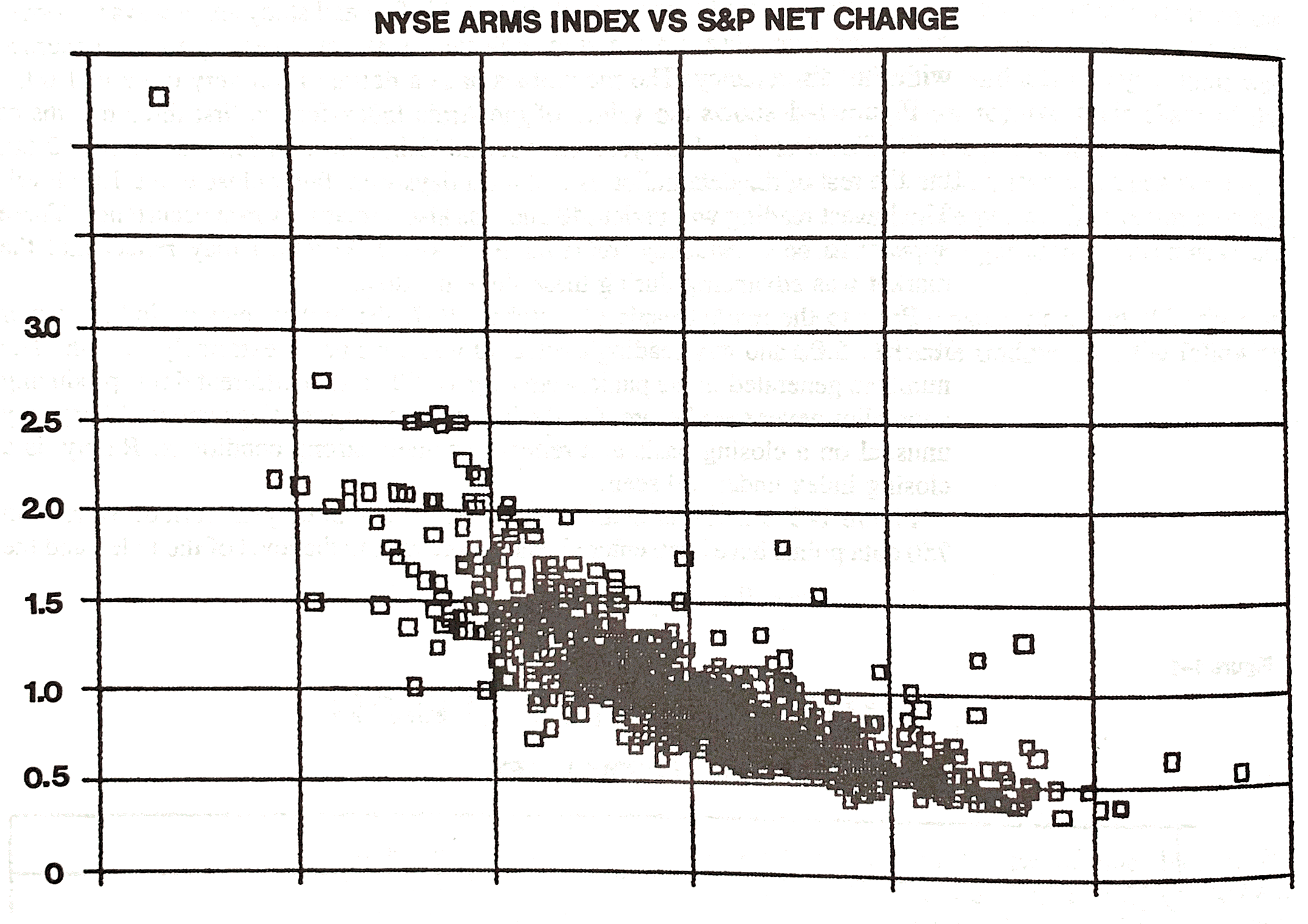
Plot of TRIN vs S&P Net Change. Courtesy The Arms Index by Richard Arms Jr. (1989)
The plot is missing the x-axis in his book, which would have been nice to have as well, but his chart suggests there is a kind of parabolic relationship between the % Change and the TRIN index. Lets look at a plot of more recent data. Following is a plot of the $TRIN
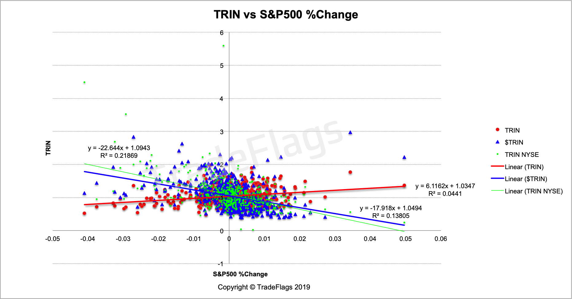
Plot of $TRIN (BLUE), regular TRIN (RED) and the NYSE TRIN (GREEN) versus S&P500 %Change on our US stocks population, together with linear interpolation of the data.
When we linearly interpolate the data we get negatively sloping lines for the $TRIN and the NYSE TRIN, while for the regular TRIN we get a positively sloping line. The change in slope is due to the normalization of the volume, ie. using the dollar notional volume instead of the regular share volume. Now why doesnt the NYSE TRIN not show such a positively sloping line? We cannot answer this question. It could be due to nature of the set of stocks taken to calculate the NYSE TRIN. We tried to replicate this NYSE TRIN but we encountered problems in determining exactly what is used in the calculation. Looking at the WSJ page for the TRIN we couldnt confirm or verify the volume being used in the calculation of their TRIN when we compare the official volume with the CBOE page for daily volume. The volumes dont line up, so we are lost at how exactly is the WSJ TRIN calculated. Their volume numbers are off by up to 30% compared to the official exchange volume published on the CBOE. We leave this as further work since its really a separate study.
Comparison with the Nasdaq Composite
We continue looking at the $TRIN and regular TRIN compared to further indices. Here is a plot versus the NASDAQ composite %Change. The Nasdaq Composite has around 3300 names and is also market-cap weighted just like the S&P500.
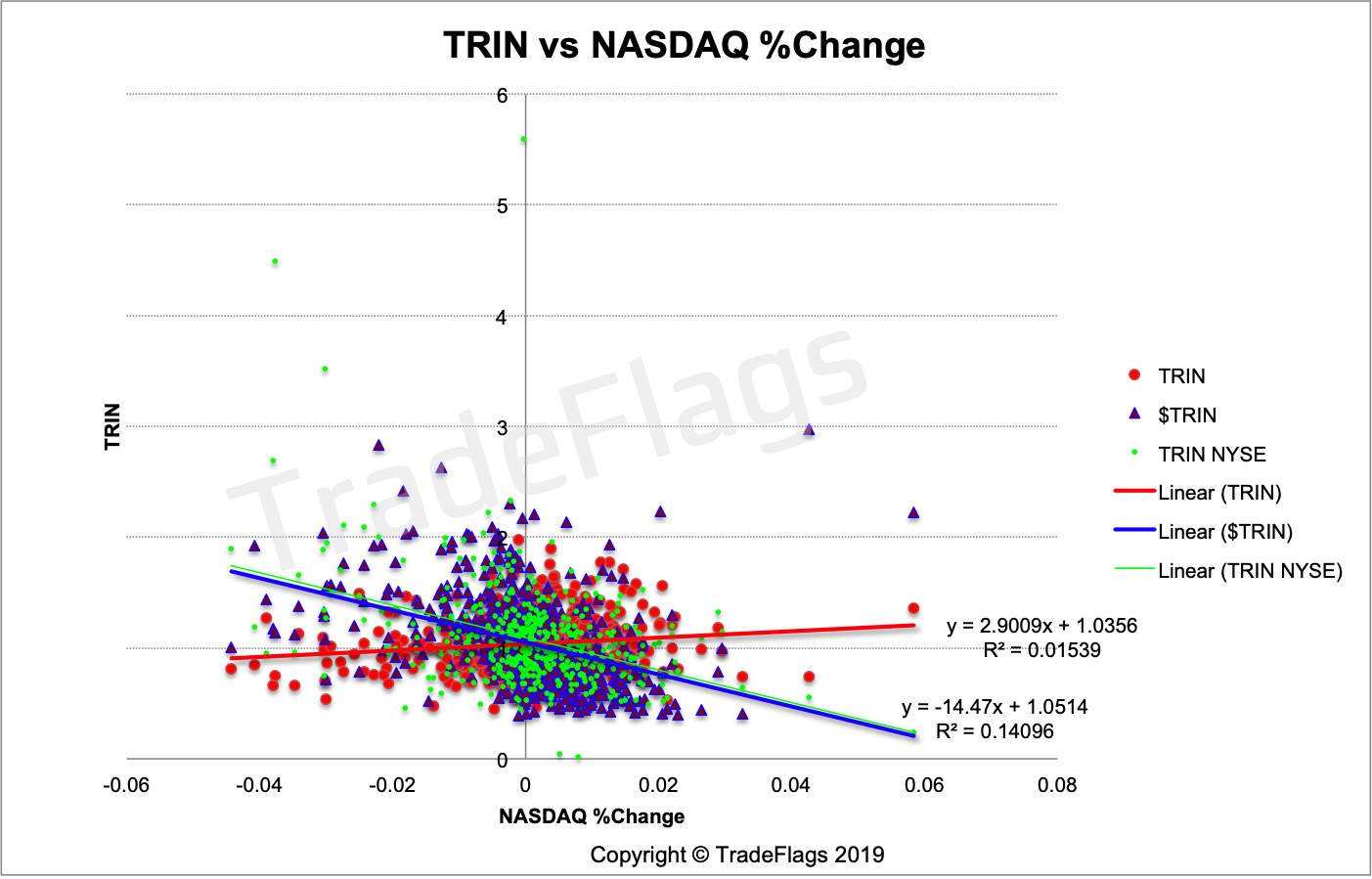
Plot of $TRIN (BLUE), regular TRIN (RED) and the NYSE TRIN (GREEN) versus NASDAQ %Change on our US stocks population, together with linear interpolation of the data.
Comparison with the Russell 2000
This following plot shows the $TRIN and regular TRIN versus the Russell 2000 index. The Russell 2000 is composed of 2000 small-cap names free-float weighted.
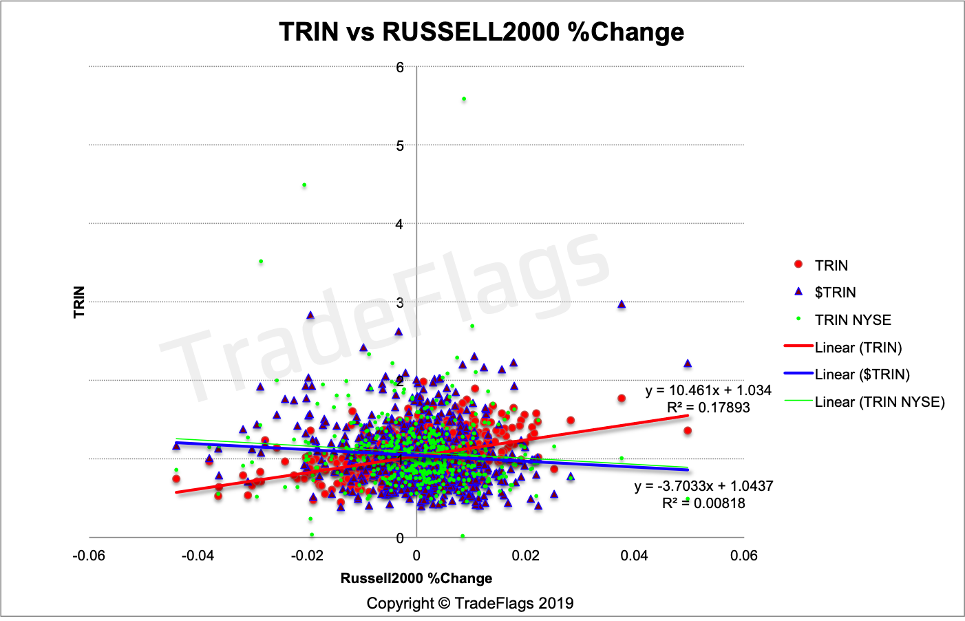
Plot of $TRIN (BLUE), regular TRIN (RED) and the NYSE TRIN (GREEN) versus Russell2000 %Change on our US stocks population, together with linear interpolation of the data.
Comparison with the Dow Jones Industrial Average
Here is a plot versus the Dow Jones Industrial Average which comprises 30 names and is price-weighted as compared to market cap weighted. You see the relationship between the TRIN of 2700 names break down when mapped against the 30 name DJIA. This is very likely due to the price-weighting of the index which gives more weight to the index to stocks with bigger stock prices as opposed to market caps.
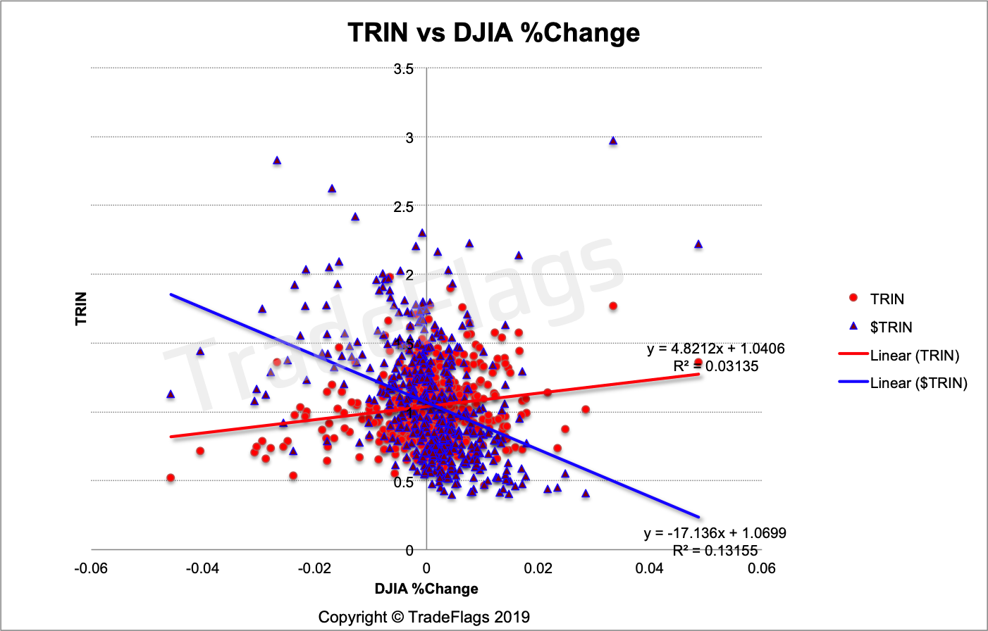
Plot of Normalized TRIN (BLUE) and regular TRIN (RED) versus the Dow Jones Industrial Average %Change on our US stocks population, together with linear interpolation of the data.
Comparison with the MSCI World
How does the $TRIN look like if we take the global stock market into account and normalize all stock prices in USD and all notionals in USD. We are comparing our global population of 4012 names with the MSCI World which covers around 4500 stocks globally and is also market cap weighted.
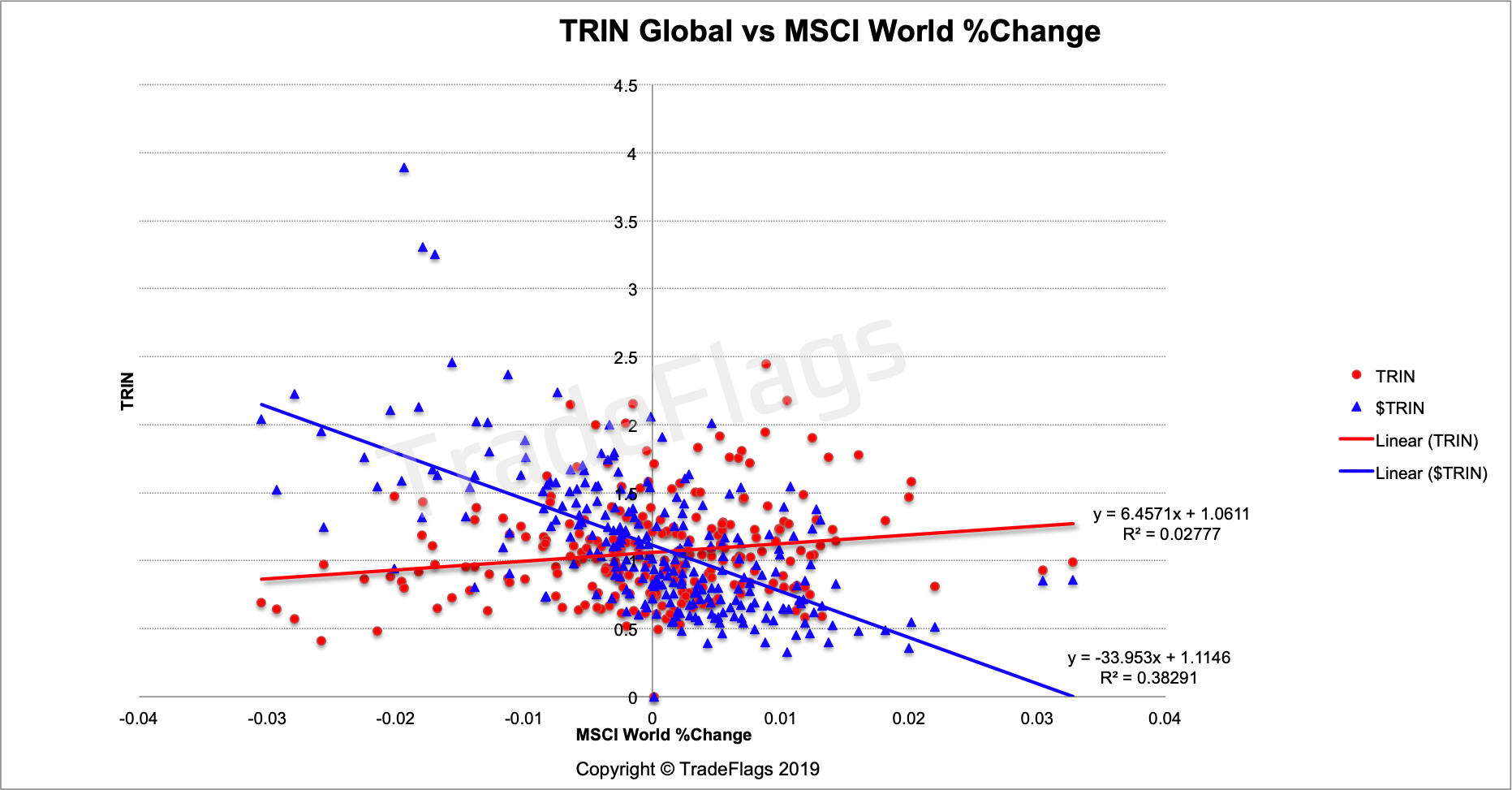
Plot of Normalized TRIN (BLUE) and regular TRIN (RED) versus the MSCI World %Change on our global stocks population, together with linear interpolation of the data.
You can again see a marked improvement in the negative slope of the linear interpolation and a more pronounced wedge shaped cloud of data similar to Richard Arms plot above.
We want to have a quick look an plot the three MSCI World ETF trackers against the $TRIN and see what it looks like for those three ETFs against our $TRIN. In theory they should all be identical.
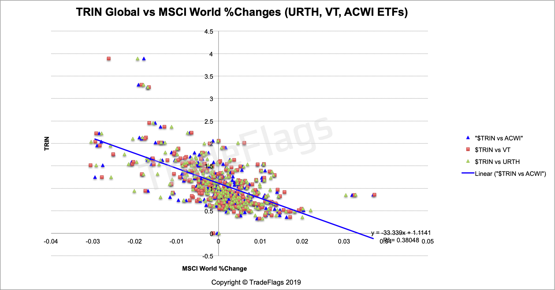
Plot of the global $TRIN versus the URTH, VT and ACWI ETFs tracking the MSCI World Index.
Comparison with the MSCI Hong Kong
Here is a plot of the $TRIN and regular TRIN for the Hong Kong stock market compared to the ishares MSCI H0ng Kong ETF (EWH). It is not very pronounced in this case but still the slopes are negative. The EWH is one of the oldest country based ETF and comprises 53 names and is market cap weighted compare this to our population of 81, it looks like smaller populations lead to more noise.
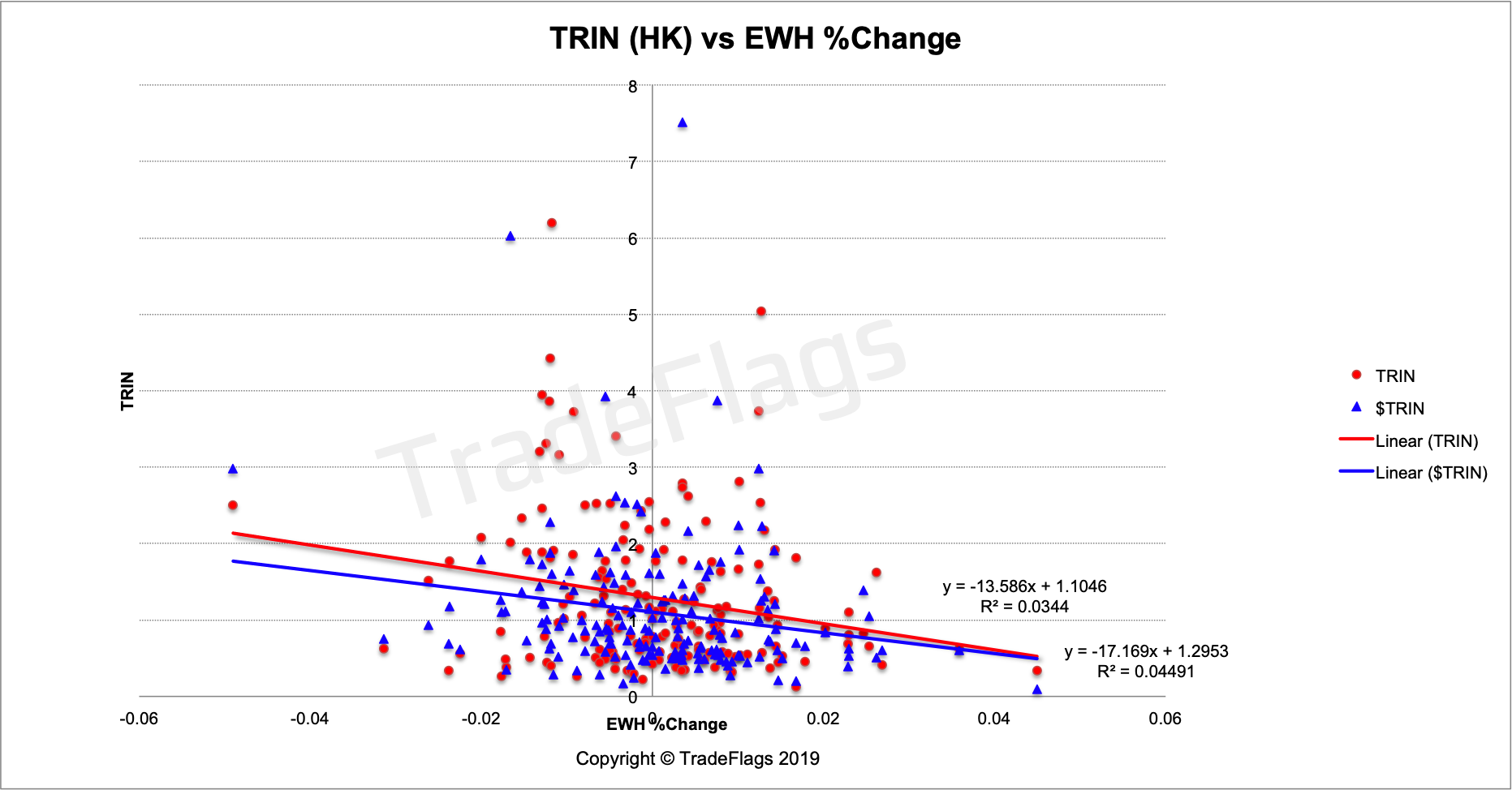
Plot of Normalized TRIN (BLUE) and regular TRIN (RED) versus the Ishares MSCI Hong Kong ETF %Change on our Hong Kong stock population, together with linear interpolation of the data.
Comparison with the MSCI Germany
Looking at the $TRIN and regular TRIN for the German stock market and comparing this to the iShares MSCI Germany ETF (EWG) we get this chart. This chart shows a very clear wedge shaped structure and both charts of the regular and $TRIN are negatviely sloped and wedge-like, but you you clearly see the wedge shape is more pronounced for the $TRIN. The MSCI Germany comprises 71 names market cap weighted and we compare it to our population of 161 the noise is a lot less here and there is a clear relationship between them.
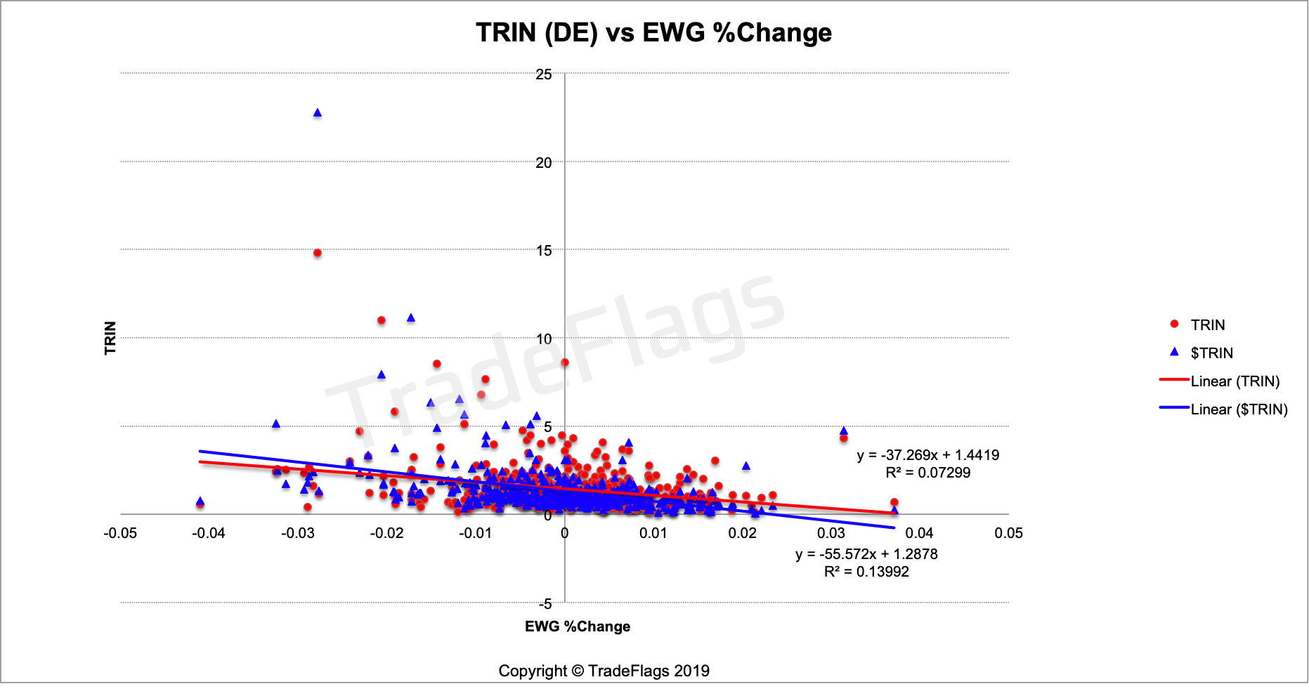
Plot of Normalized TRIN (BLUE) and regular TRIN (RED) versus the Ishares MSCI Germany ETF %Change on our German stock population, together with linear interpolation of the data.
The $Arms and $TRIN time series
In the following we will chart some of the $TRIN time series. We plot three moving averages (5, 10 and 100 day) and plot the 85% and 99.7% probability averaged over 200 values, similar to how we dealt with the regular TRIN in the first part of research here.
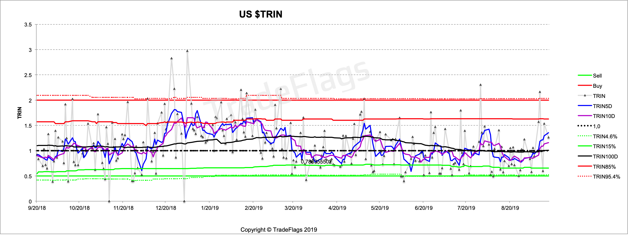
US $TRIN with the 5D, 10D and 100D moving average and the 85% and 97.2% probabilities in red and green together with 0.5 and 2.0 as a reference. Dotted black line is 1.0.
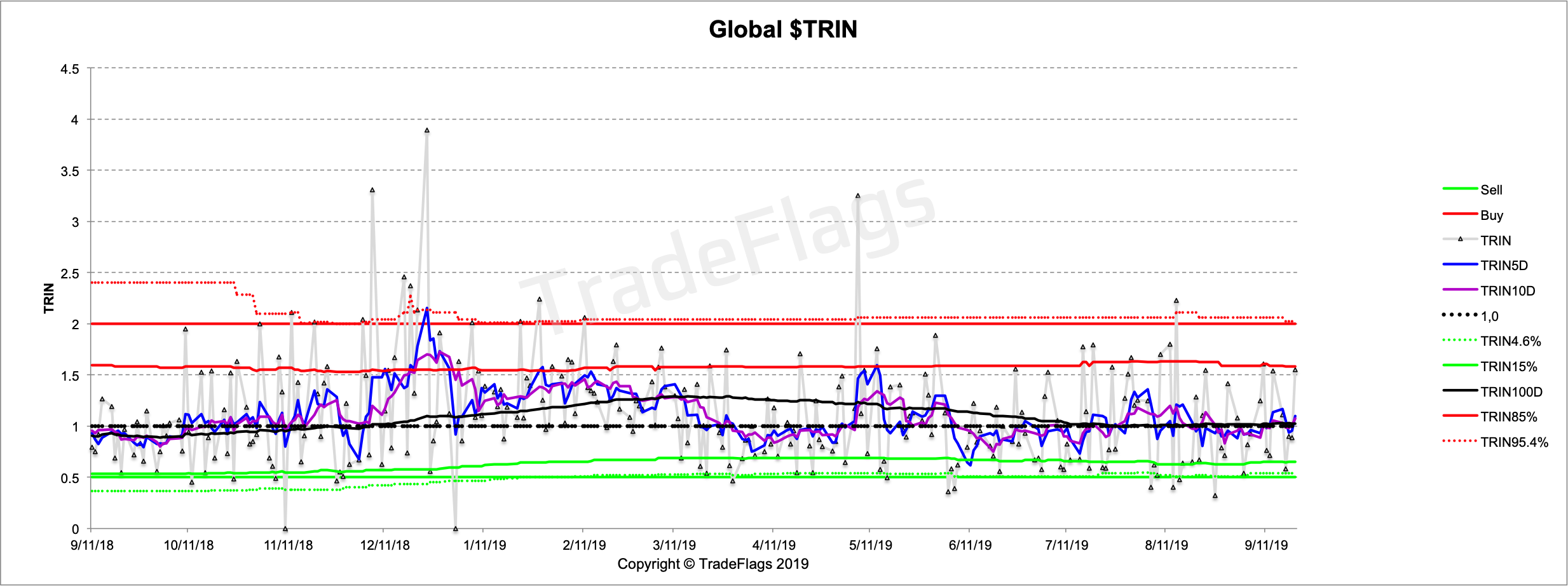
You can see the period around December 2018/ January 2019 is a lot more pronounced towards the SELL side than before and we know from the charts above it is working a lot better than non-normalized. Lets look further back into the past we get this
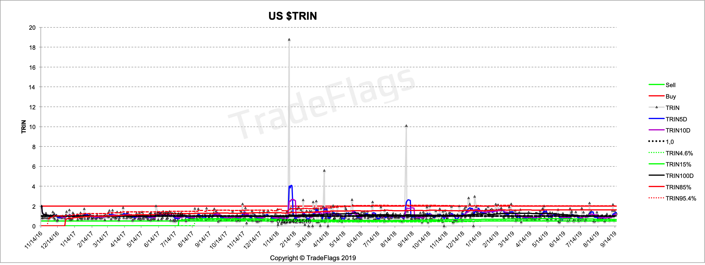
A longer dated chart for US $TRIN with the 5D, 10D and 100D moving average and the 85% and 97.2% probabilities in red and green together with 0.5 and 2.0 as a reference. Dotted black line is 1.0.
Here you can see the Feb 2018 selloff peak very very clearly as a very extreme level. So high that even the 5 day and 10 day average get pulled beyond a 97% probability level. We also see the peak in September 2018 which is also a significant date which kind of set the start off a broader selloff that peaked in December/January of 2018/2019.
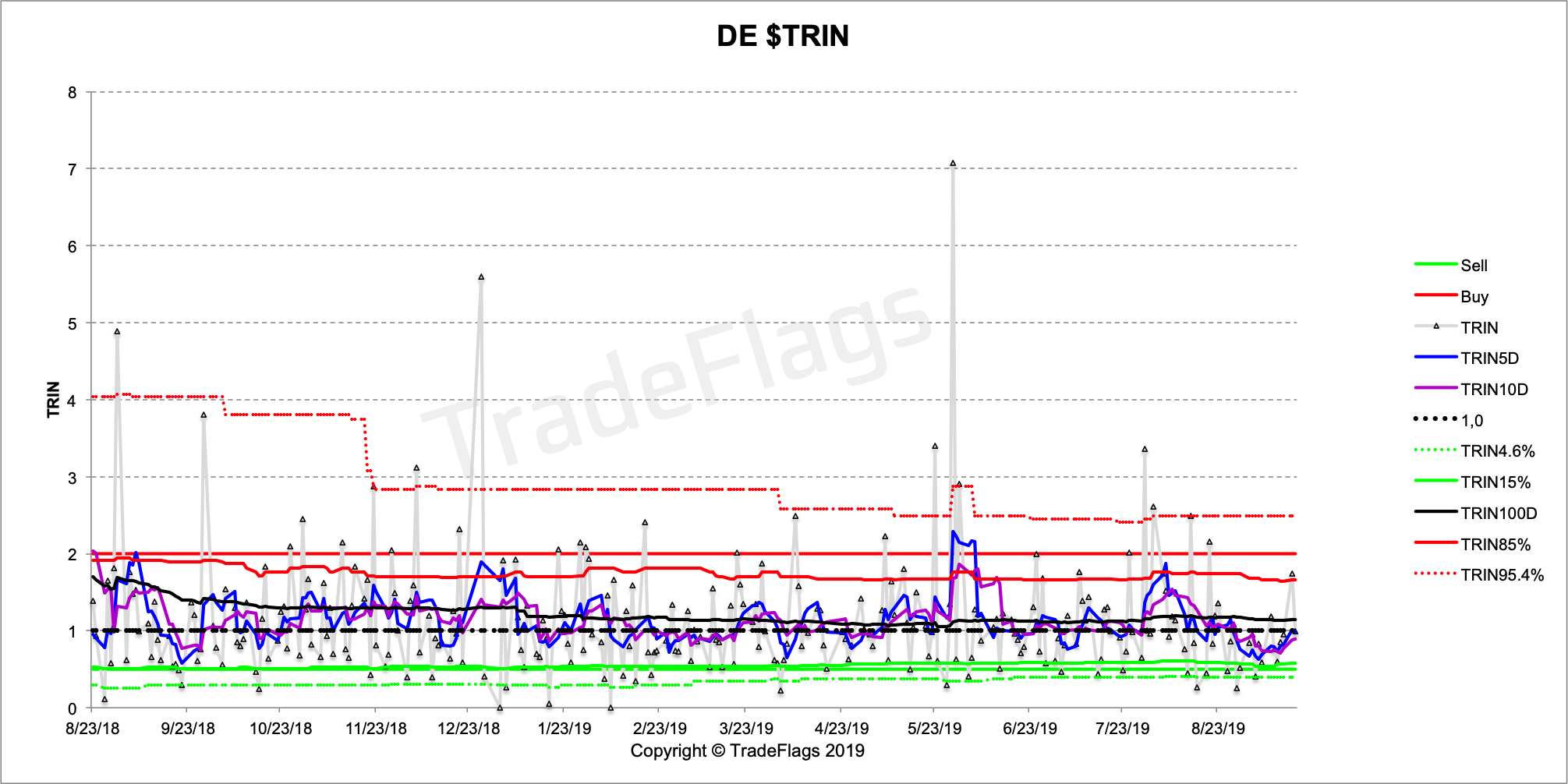
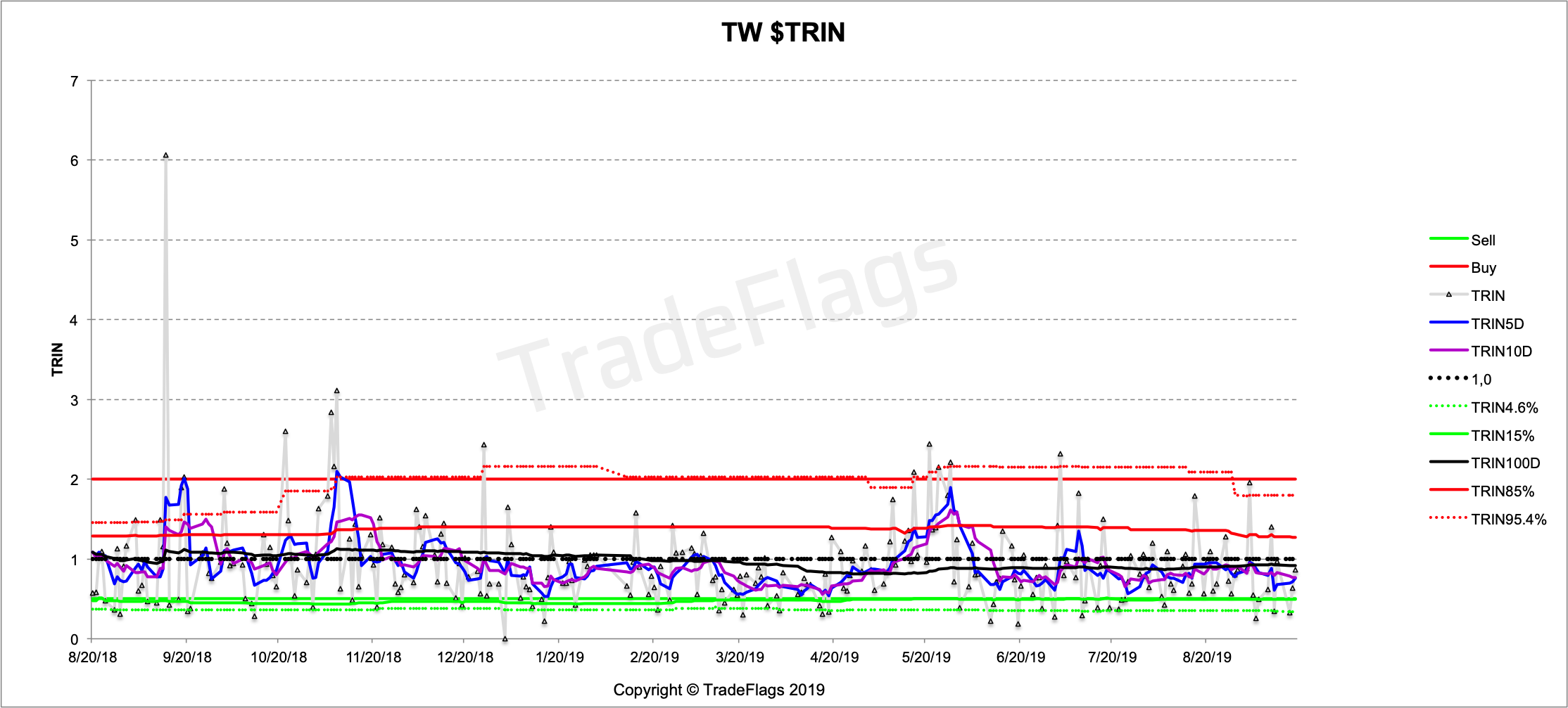
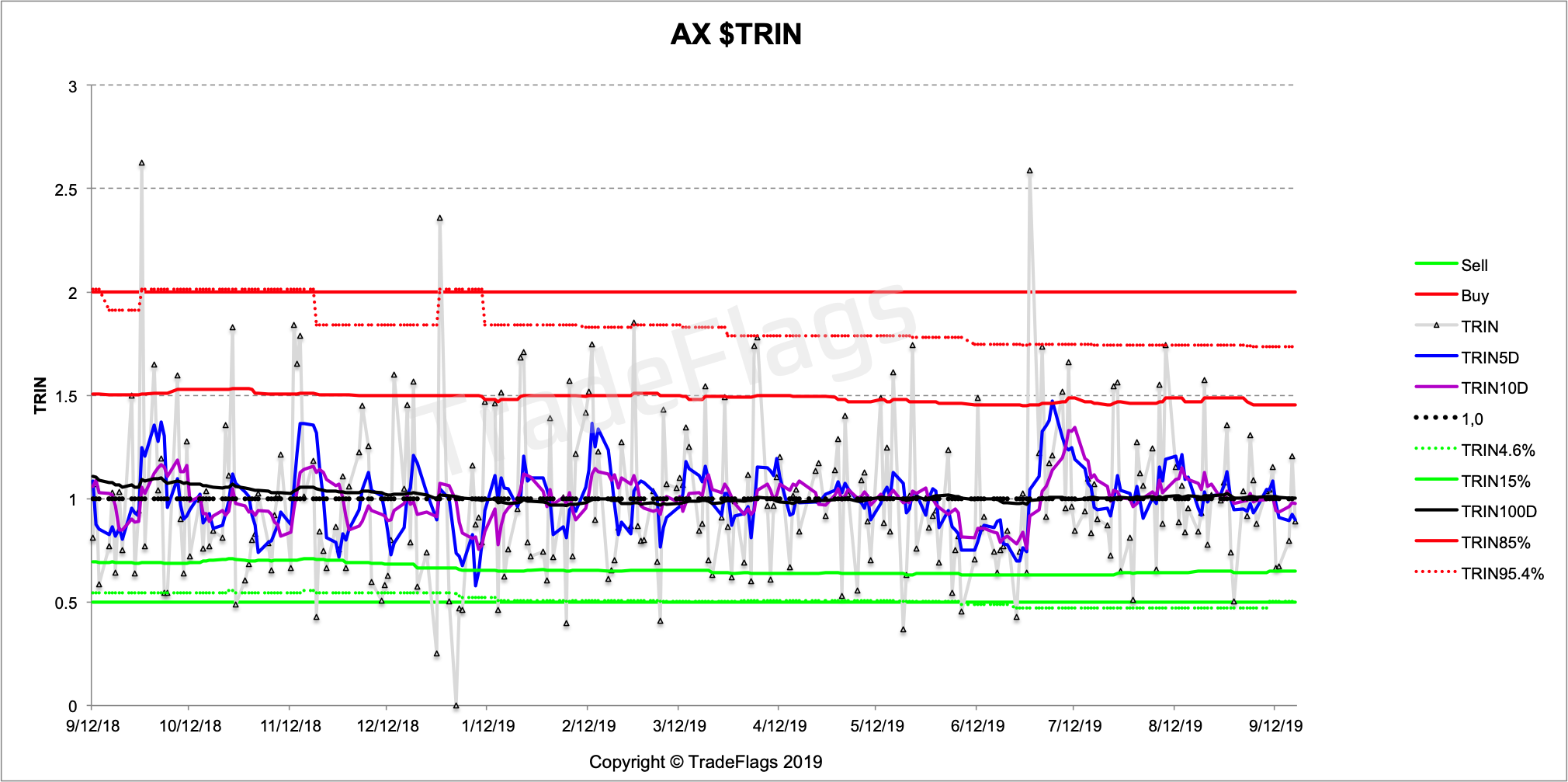
Following are a couple more charts of the $TRIN time series for different regions. First the global $TRIN timeseries
the $TRIN for Germany
and Taiwan and Australia.
Based on the analysis of the conventional Arms Index (TRIN) calculation (Part 1) we have deduced an improved version of the TRIN, which we showcase here and compare it to data of the conventional TRIN. We show how a regular weighted TRIN leads to a lot more noise given any number of stock underlyings and leads to a more or less useless sloping data set and show that the improved dollar weighted notional traded $TRIN has the expected behaviour of the TRIN and doesnt lead to such distortions through price-effects. Furthermore we expose flaws in the common published values for the TRIN (WSJ) and warn of the dangers of using the commonly published figures, based on inconsistent figures and a flawed weighting of the index.
References
- "The Arms Index" Richard W Arms Jr.
- "The New Arms Index Course" Richard Arms DVD Oct 2008
- https://www.wsj.com/market-data/stocks/marketsdiary
- ttps://markets.cboe.com/us/equities/market_share/
- List of NYSE stocks in Arms Index
- List of NYSE stocks in Arms Index (FTP download)
- Photo Courtesy: Sawyer Bengtson YaSH0DbU5lE "unsplash"